Monday, March 29, 2010
WEEK 4 | YOUTUBE VID
This is a short animation I've done last year on discovery space in the red centre
WEEK 4 | MODEL 2 WITH TEXTURE
Experimenting texture on last week's model. The textures brings out much more depth and detail to it
WEEK 4 | TEXTURE TRIAL
Test of textures combined in SU. I was pleasantly surprised by how nicely they all fit together, especially the ones that i tried to link the edges when drawing them out.
WEEK 4 | 36 TEXTURES
Textures for Week4. The clients are Piccinini (above) and Goodwin (below). The general idea behind the categorization was Piccinini was more organic and specialised in human forms and thus the textures are more streamlined and curved. On the other hand, Goodwin's work are sharp and rigid.
Monday, March 22, 2010
WEEK 3 | 2ND SKETCHUP MODEL-DRAFT
Words: Nurturing (above), encapsulating (below)
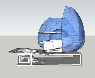
Week 3's draft model. Here i tried to mimic the shape of 2 hand with glass shells in response to Piccinini's word "nurturing". Below is a simple representation of Goodwin's word "encapsulating"
WEEK 3 | STAIR 1
In the process of brainstorming ideas for stairs, one concept really interested me. Stairs are essentially bridges except for one thing; that stairs work in a inclined plane. This brought me to the Millennium bridge in London, a rather unique suspension bridge. For this stair design, steel is tensioned and anchored to the ceiling and floor, and glass treads are attached to the tensioned steel, creating a slanted suspension bridge.


reference: http://hhollick.com/v-web/b2/images/millenium_bridge.jpg, viewed 22/03/2010
Thursday, March 18, 2010
Monday, March 15, 2010
WEEK 2 | 1ST SKETCHUP MODEL-DRAFT
My first attempt at the Sketchup model. The words for the sketch are "intertwined" (Goodwin) and "raw" (Swallows). I tried to integrate both worlds by lifting the underground space up and in effect, providing a ramp to the stirs of the above ground space. One obvious challenge is the structural integrity of the above ground space which will require further thoughts


Tuesday, March 9, 2010
WEEK 1 | 3 PICTURES

SOMETHING BEAUTIFUL: To me nothing's more beautiful than being over 30,000ft in the air and seeing such a colourful sky. It gives me a sense of freedom and lightness, amazement and disbelief.

GREAT ARCHITECTURE: This is Calatrava's design for the train station at Lyon-Satolas Airport. The building serves as a gateway for passengers transiting from airport to train. I like the transparency of the building, being able to see the structural loads in steel members whilst appreciating the streamlined form. At night, the delicate illuminated tracery of steel elements adds rhythm to the swooping bird, suggestive of metallic feather swept back by passing trains and aircraft.
CREATIVE WORK: This is a multi-purpose robot i "created" back in year 9 for IST class project. Its main function is to be a replacement of a security guard, being able to speed up and knock intruders onto their feet and trapping them in self-deployed nets or knocking them out with its robotic arms. Other than being a security robot, it can vacuum the room, become a toy car and a home entertainment centre, with fold out screens and speakers
Subscribe to:
Comments (Atom)


